Histogram
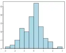
A histogram is a concept from statistics. It is a graphical display that tells us about the distribution of the samples involved. They are commonly a picture made from a table with many categories. The table tells how many samples there are in each category.

The word histogram is derived from histos and gramma in Greek. Histos means web or mast. Gramma means drawing, record or writing. A histogram of something is therefore, etymologically speaking, a drawing of the web of this something.
A histogram is a graphical representation of the distribution of numerical data. It is a type of bar chart that shows the frequency or number of observations within different numerical ranges, called bins. The bins are usually specified as consecutive, non-overlapping intervals of a variable. The histogram provides a visual representation of the distribution of the data, showing the number of observations that fall within each bin.[1]
Similar ideas
The histogram is one of the seven basic tools of quality control, which also include the Pareto chart, check sheet, control chart, cause-and-effect diagram, flowchart, and scatter diagram.
A population pyramid is two histograms.[2]
A generalization of the histogram is kernel smoothing techniques. This will construct a smooth probability density function from the supplied data.
References
- "Histogram maker". Archived from the original on 2023-01-27. Retrieved 2023-02-07.
- Forbes, Sharleen; Harraway, John. "Population pyramids". Graph it in Excel. Retrieved 2020-06-10.