| Completion status: this resource is ~50% complete. |
Graphing visualises data to facilitate perception and interpretation of distributions and relationships. Graphs should be accompanied by descriptive statistics.
This page provides an overview of graphing steps and principles and types of graphs.
Watch "Science is beautiful", a 5:30 minute Nature Video which explores three different visualisations: Florence Nightingale (health), genome overlaps, ocean currents.
Watch "Is Pivot a turning point for the web?", a 6:25 minute TED talk about a Microsoft technology which enables flexible exploration and zooming in and out of visualised data. This illustrates the power of being able to visualise data as a whole in order to discover patterns and links.
Graphing - How to
“Visualization is any technique for creating images, diagrams, or animations to communicate a message.” - Wikipedia
Steps
Creating effective data visualisations is not easy. Suggested basic steps are:
- Identify the purpose of the graph
- Select which type of graph to use, based on the variable(s)' level of measurement
- Draw an appropriate graph
- Modify the graph to be clear, non-distorting, and well-labelled.
- Disseminate the graph (e.g., include it in a report)
Principles
"Like good writing, good graphical displays of data communicate ideas with clarity, precision, and efficiency.
Like poor writing, bad graphical displays distort or obscure the data, make it harder to understand or compare, or otherwise thwart the communicative effect which the graph should convey." Michael Friendly – Gallery of Data Visualisation

- Maximise objective display of truth. According to Tufte, the “lie factor” in graphs is size shown in graph divided by statistical size. It should be 1.
- Avoid distortion (Tufte)
- Avoid excessive use of colour - effective graphs are often monotone.
- Clearly label axes and provide a meaningful, descriptive figure caption. Use a legend and/or footnotes as appropriate to provide sufficient information for the graph to be interpretable as a whole without detailed references to accompanying text.
- Graphs are subject to the law of parsimony - i.e., they should be as simple as necessary to clearly communicate about data of interest.
- The whole of the data is more than the sum of the parts (Gary Flake, 2010)
- Show the data (Tufte)
- Reveal data at several levels (Tufte)
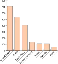
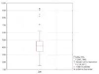
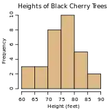
Graph typesThe choice of graph will depend on the variables' level of measurement. UnivariateGraphs of a single variable.
|
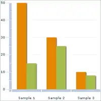
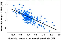
BivariateGraphs of the relation between two variables. Clustered bar-graph
|
See also
- Data visualization (Wikipedia)
- Descriptive statistics
- Edward Tufte (Wikipedia)
- Information graphics (Wikipedia)
- Introduction to graphs
- Descriptives and graphing (Tutorial)
- Descriptives and graphing (Lecture) - Graphing (Slides)
