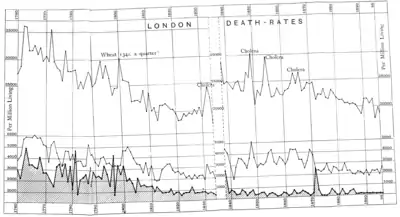
DIAGRAM I.
London Death-Rates per Million Living from 1760 to 1896.
The Upper line shows rates of Death from All Causes.
The Middle line shows rates of Death from Zymotic Diseases, including Measles, Fevers. Whooping-cough, and Diphtheria.
The Lower line (shaded for distinctness), Small-pox.
The blank four years, 1834-8, are omitted because they are the last of the old "Bills of Mortality," and are considered to be very imperfect.
From 1838 onwards is the period of complete Registration.
Each ten years is indicated at the bottom and top of the diagram.
The figures at the sides and centre show the mortality per million.
The Upper line (total mortality) is on a smaller vertical scale, and is brought lower down to allow of its being included in the diagram.
Authorities.
The Hues in the diagram from 1760 to 1884 are calculated from the figures given in the Second Report, pp. 289-91. with those for other diseases from Dr. Creighton's History of Epidemics in Britain:the population at the different periods being taken from the best available sources (Maitland, and the the Report of the Registrar-General). The later portion is entirely from the Reports of the Registrar-General.
