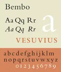
In Latin script typography, roman is one of the three main kinds of historical type, alongside blackletter and italic. Sometimes called normal, it is distinct from these two for its upright style (relative to the calligraphy-inspired italic) and its simplicity (relative to blackletter).
During the early Renaissance, roman (in the form of Antiqua) and italic type were used separately. Today, roman and italic type are mixed, and most typefaces are composed of both an upright roman style and an associated italic or oblique style.
History
Roman type was modelled from a European scribal manuscript style of the 15th century, based on the pairing of inscriptional capitals used in ancient Rome with Carolingian minuscules.
Early roman typefaces show a variety of designs, for instance resembling what would now be considered blackletter.[5][6][7] Printers and typefounders such as Nicolas Jenson and Aldus Manutius in Venice and later Robert Estienne in France codified the modern characteristics of Roman type, for instance an 'h' with a nearly straight right leg, serifs on the outside of the capital 'M' and 'N', and 'e' with level cross stroke, by the 1530s.[8][9]
Use today
Popular roman typefaces include Bembo, Baskerville, Caslon, Jenson, Times New Roman and Garamond.
The name roman is customarily applied uncapitalized distinguishing early Italian typefaces of the Renaissance period.
See also
Notes
- ↑ Amert, Kay (April 2008). "Stanley Morison's Aldine Hypothesis Revisited". Design Issues. 24 (2): 53–71. doi:10.1162/desi.2008.24.2.53. S2CID 57566512.
- ↑ Vervliet, Hendrik D.L. (2008). The palaeotypography of the French Renaissance. Selected papers on sixteenth-century typefaces. 2 vols. Leiden: Koninklijke Brill NV. pp. 90–91, etc. ISBN 978-90-04-16982-1.
[On Robert Estienne's typefaces of the 1530s]: Its outstanding design became standard for Roman type in the two centuries to follow...From the 1540s onwards French Romans and Italics had begun to infiltrate, probably by way of Lyons, the typography of the neighbouring countries. In Italy, major printers replaced the older, noble but worn Italian characters and their imitations from Basle.
- ↑ Bergsland, David (29 August 2012). "Aldine: the intellectuals begin their assault on font design". The Skilled Workman. Retrieved 14 August 2015.
- ↑ Parkes, Malcolm Beckwith (1992). Pause and Effect: An Introduction to the History of Punctuation in the West. Aldershot, UK: Scolar Press. p. 215.
- ↑ Boardley, John (18 April 2016). "The first roman fonts". ilovetypography. Retrieved 21 September 2017.
- ↑ Boardley, John (7 February 2014). "Unusual fifteenth-century fonts: part 1". i love typography. Retrieved 22 September 2017.
- ↑ Boardley, John (July 2015). "Unusual fifteenth-century fonts: part 2". i love typography. Retrieved 22 September 2017.
- ↑ Olocco, Riccardo. "The Venetian origins of roman type". Medium. C-A-S-T. Retrieved 27 January 2018.
- ↑ Carter, Harry (1969). A View of Early Typography up to about 1600 (Second edition (2002) ed.). London: Hyphen Press. pp. 72–4. ISBN 0-907259-21-9.
De Aetna was decisive in shaping the printers' alphabet. The small letters are very well made to conform with the genuinely antique capitals by emphasis on long straight strokes and fine serifs and to harmonise in curvature with them. The strokes are thinner than those of Jenson and his school...the letters look narrower than Jenson's, but are in fact a little wider because the short ones are bigger, and the effect of narrowness makes the face suitable for octavo pages...this Roman of Aldus is distinguishable from other faces of the time by the level cross-stroke in 'e' and the absence of top serifs from the insides of the vertical strokes of 'M', following the model of Feliciano. We have come to regard his small 'e' as an improvement on previous practice.
References
- Bringhurst, Robert (2008), The Elements of Typographic Style (version 3.2). Vancouver: Hartley & Marks. Often referred to simply as "Bringhurst", Elements is widely respected as the current English-language authority on typographic style.
- Nesbitt, Alexander The History and Technique of Lettering (1957), Dover Publications, Inc. ISBN 0-486-40281-9. The Dover edition is an abridged and corrected republication of the work originally published in 1950 by Prentice-Hall, Inc. under the title Lettering: The History and Technique of Lettering as Design.
External links
 The dictionary definition of roman at Wiktionary
